

Top Ten Tuesday was created by The Broke and the Bookish in June of 2010 and was moved to That Artsy Reader Girl in January of 2018. It was born of a love of lists, a love of books, and a desire to bring bookish friends together.
The rules are simple:
-
Each Tuesday, Jana assigns a new topic. Create your own Top Ten list that fits that topic – putting your unique spin on it if you want.
-
Everyone is welcome to join but please link back to The Artsy Reader Girl in your own Top Ten Tuesday post.
-
Add your name to the Linky widget on that day’s post so that everyone can check out other blogger’s lists.
-
Or if you don’t have a blog, just post your answers as a comment.
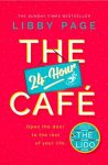
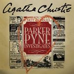
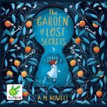
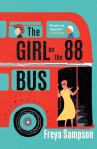
This week’s topic is Book Covers Featuring Interesting Typography and these are my choices 😉
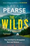
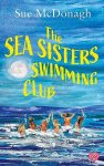
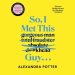
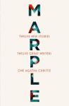
Which Covers Would Be On Your List?
📚📚📚

Ooh, I like the bus one!
LikeLiked by 1 person
Me too!
LikeLike
I like the Marple one because of the vertical text, really clever design
LikeLiked by 1 person
Yes I like it too
LikeLike
I love the typography of The Sea Sisters Swimming Club.
LikeLiked by 1 person
Yes it’s a good one!
LikeLike
You’ve got some great covers and great books there Nicki. I especially like the cover of The Sea Sisters Swimming Club.
LikeLiked by 1 person
Thanks I like that one as well!
LikeLiked by 1 person
Marple is definitely a departure!
LikeLiked by 1 person
Thanks, Jo!
LikeLike
I like the sign of The 24-hour Cafe and the Parker Pyne cover is clever. Marple really stands out though! xx
LikeLiked by 1 person
Thanks glad you like them! xx
LikeLike
Marple is brilliant and totally stands out from the rest. Great choices!
LikeLiked by 1 person
Thanks!
LikeLike
a fabulous selection! xx
LikeLiked by 1 person
Thanks! xx
LikeLike
I’m reading So, I Met This Guy right now but the Australian cover is much more prosaic
Thanks for sharing your #TTT
LikeLiked by 1 person
Hope you enjoy it as much as I did!
LikeLike