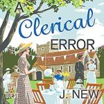
I love this meme created and hosted by Inge @The Belgian Reviewer highlighting the difference between covers for the same book. I’ve noticed the same thing happening with audiobooks as well, so let’s have a look at some covers.
Audiobooks are on the left and paperbacks/hardbacks/ebooks are on the right
No choice here at all I definitely prefer the same covers for the audiobook and paperback


This is an easy choice as I much prefer the paperback cover with the open suitcase


A harder choice, but I prefer the black and white cover on the left.


I definitely prefer the paperback with the take away coffee cup especially as it’s part of the storyline.


I really like the cover for the audiobook on the left, although the middle cover is good


I like the clean cover of the middle book even I do love the colour red


I like the audiobook cover, but I also like the cover with the red and white, so a draw I think!


I always prefer covers that don’t feature real people!
LikeLiked by 2 people
It seems I’m the same with these covers but not always, it depends on the people! lol
LikeLiked by 1 person
I would agree with Linda…not a fan of real people. Would not encourage me to pick up a book!
LikeLiked by 1 person
Looks like I’m the same for this too!
LikeLiked by 1 person
Oh great, new choices. Thanks for the shout out again too Nicki! As it happens, I have a new post tomorrow in the series as well :-).
I’d definitely choose the open suitcase with the book and the take away coffee cup too! I think I still prefer the middle cover of Need To Know with all the photographs, and I’m still going with the red cover for The Sentence is Death. The last cover isn’t an easy choice either, nothing really stands out but I think I choose the audiobook cover after all so no draw for me :-).
LikeLiked by 2 people
Thanks looking forward to your post tomorrow xx
LikeLiked by 1 person
I listened to Year One and though I like the cover on the right, the black and white one best represents the tone of the story. I was preferring the audio cover of the Jane Fallon book until you mentioned that coffee cup was a critical element of the story. I love when the cover ties into the story that well.
Fun post, Nicki!
LikeLiked by 1 person
Thanks I love it when they coincide as well!
LikeLike
Love this feature. Hardback and paperback covers can differ so much. I’m another who doesn’t love real peopleon covers
LikeLiked by 1 person
Thanks I’m always amazed at how different covers can be!
LikeLike
I’ll echo the comments about having people on covers – I really don’t like it! It’s one of the reasons I hate movie / TV tie in editions! This is a fun meme though 🙂
LikeLiked by 1 person
Thanks and so interesting that quite a few others don’t like people on covers as well!
LikeLiked by 1 person
I was thinking the same! Maybe we should let the publishers know? 😉
LikeLiked by 1 person
I’m with you on the cover of Letters to Iris! Jane Fallon has some of the best paperback covers, so I’ll always choose them. I own a copy of Need to Know with the cover in the middle, I love it!
LikeLiked by 1 person
Yay brilliant!
LikeLiked by 1 person
The different cover designs for the same book always fascinate me, I often wonder what factors in the decision making. The covers for Letters to Iris are interesting – the audio book cover is one I would likely skim past but the print book cover has me wanting to pick the book up! Great post 🙂
LikeLiked by 1 person
Thanks it is fascinating!
LikeLike
Interesting that not only did the cover differ, but so did the title with Love, Iris and Letters to Iris. I am fickle with covers. I like them to catch my eye, which usually means colourful and a large graphic or image. Some of these were tough to decide my favourite.
LikeLiked by 1 person
I know it’s very strange they were they change the title as well as the cover sometimes!
LikeLiked by 1 person
I definitely agree with your choices!
LikeLiked by 1 person
Yay!
LikeLiked by 1 person